
Short version
- Most personalisation problems start with a vague text box, not a careless customer.
- Label every box with exactly what goes in it, and show the character limit as they type.
- Show real examples, including long names, short names and names with accents.
- Give people a way to see what it will look like before they pay.
- Confirm the text by email before you start, and say clearly that personalised items can't be returned for a change of mind.
If you sell personalised products online, you'll know the feeling. An order comes in. You read the personalisation.
And something about it makes you pause.
Is that meant to be "Ciara" or "Ciaran"? Did they want the date in numbers or words? Is "Mum & Dad xx" supposed to have the kisses?
Did they mean the initials on the front or the back?
Sometimes you email to check. Sometimes you make your best guess. And now and then, the guess is wrong, the item is already made, and you're both stuck with something nobody wants.
Here's the uncomfortable truth: most of these problems don't come from careless customers. They come from product pages that leave too much room for guessing.
This article shows you how to set up a personalised product page that gets the right words, in the right format, with far fewer mistakes. We'll look at text boxes, character limits, examples, previews, accents, confirmations, and what to say about returns.
Why personalisation mistakes are usually a page problem
Think about the moment someone types their personalisation.
They're probably on a phone. They might be in a hurry, buying a gift with a deadline. They see a small box labelled "Personalisation" and type something in.
They can't quite see the whole thing at once. They don't know if you'll use capitals the way they typed them. They're not sure what fits.
Then they press "Add to basket" and move on.
Every one of those small uncertainties is a chance for a mismatch between what they meant and what you make. And because personalised items can't usually be resold, every mistake costs real money and time.
The good news is that each of those uncertainties can be fixed on the page.
Meet Tidemark Stamps, and the keyring that said "Grnadad"
This is an illustrative example.
Tidemark Stamps is a small business run by Cormac, who hand-stamps brass and copper keyrings, bookmarks and luggage tags with names, dates and short messages.
His product page had one text box labelled "Your personalisation (max 20 characters)".
Most orders were fine. But every week or two, something went wrong.
Tidemark's personalisation problems over three months
- "Grnadad" stamped exactly as typed. The customer hadn't noticed the typo.
- A customer wrote "Front: Sinéad, Back: 2019" in one box. Cormac wasn't sure if they wanted the words "Front" and "Back" stamped too.
- An order for "SEÁN" arrived as "SEAN", because his stamp set didn't have accented letters. The customer was upset.
- Someone typed 24 characters. The box cut it off at 20 without warning.
- A gift buyer wrote "Love you always, from M" and wanted it on two lines. Cormac stamped it on one.
None of these customers was careless. The page just didn't give them enough help.
Label every text box with exactly what goes in it
One box labelled "Personalisation" asks the customer to work out your system. Several clear boxes tell them.
If your item has more than one place for text, give each place its own box.
Cormac changed his luggage tag page to this:
Tidemark's new text boxes
Front of tag: name or word (up to 10 letters) Back of tag: short message or date (up to 12 characters, optional)
Now there was no guessing about "Front" and "Back". Each box did one job.
Say what kind of text you expect
Small hints inside or under the box help a lot.
- "Name or word, for example: ROWAN"
- "Date, for example: 14.06.25"
- "Initials only, for example: M.K."
These examples show the format you want without a long explanation.
Tell people how you'll handle capitals
If you stamp everything in capitals, say so: "All letters are stamped in capitals." Otherwise people who carefully type "McCarthy" with a capital C in the middle will be disappointed when it comes out as "MCCARTHY".
If you can do mixed case, tell them to type it exactly as they want it.
Show the character limit as people type
"Max 20 characters" in a label is easy to miss. And many people don't know whether spaces and punctuation count.
The best fix is a live counter that shows how many characters are left as someone types. Many shop platforms and personalisation apps offer this. If yours does, turn it on.
If it doesn't, make the limit clear and specific in the label:
- "Up to 10 letters. Spaces count as letters."
- "Up to 12 characters, including spaces and full stops."
And make sure the box stops people typing more than the limit, rather than silently cutting it off after they've finished.
Show real examples, including the awkward ones
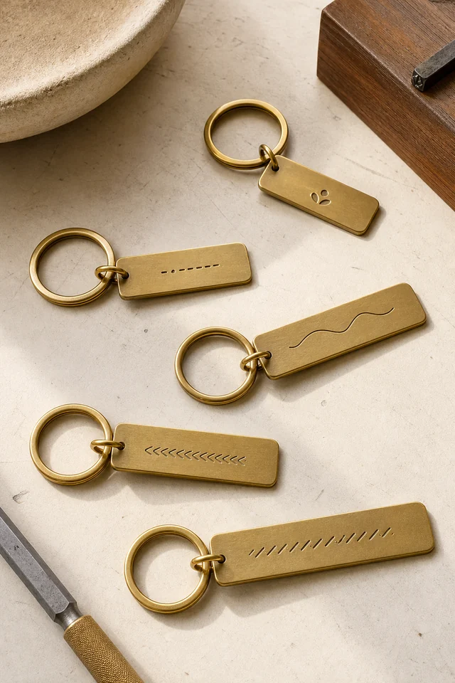
A photo of a finished piece with "EMMA" on it is lovely. But it only tells people what a short, simple name looks like.
What about a long name? Two names? A name with an apostrophe?
A date? A name with accents?
Show those too.
Cormac now has a photo for each of these:
- A short name: "JO"
- A long name at the limit: "ALEXANDRA"
- Two short words: "MUM & DAD"
- A date on the back
- A name with an apostrophe: "O'NEILL"
These photos answer questions people didn't know they had. "How small does the text get on a long name?" "Does the ampersand look nice?" "Is there room for both names?"
The accent and special character problem
This one deserves its own section, especially in Ireland, where so many names carry a fada: Seán, Áine, Siobhán, Pádraig, Róisín.
If you can do accents, say so proudly near the text box: "Fadas and accents are welcome."
If you can't, you must say so before people order. A customer who types "SEÁN" and receives "SEAN" may feel their name has been changed. For some families, that really matters.
Cormac's stamp sets didn't have accented letters. He looked into it and found he could buy a small accent punch and add the fada by hand. Now his page says: "Fadas added by hand.
Just type the name as normal, with the fada."
If you can't offer accents at all, a clear line works: "We can't stamp accents. If your name has one, it will be stamped without it." At least then the customer chooses with full knowledge.
The same goes for other special characters: hearts, emojis, symbols, non-English letters. Say exactly which ones you can and can't do.
Let people see it before they pay
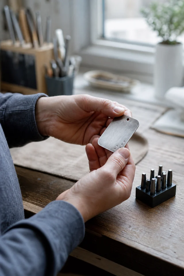
A preview is the most powerful way to prevent mistakes. When people see their own words on the product, typos jump out in a way they don't in a tiny text box.
There are a few ways to do this, depending on your setup.
A live preview on the page
Some shop platforms and personalisation apps can show the customer's text on an image of the product as they type. It doesn't need to be exact. Even a simple mock-up in the right font and layout helps people spot errors.
Test the preview with five awkward inputs before you trust it: the shortest name, the longest allowed name, a name with a fada, an apostrophe, and a message containing an ampersand. Check the narrowest phone view too.
A preview that works for EMMA but clips ALEXANDRA, changes Seán to Sean, or drops the second line has not prevented the problem; it has only moved it later in the order.
A "your text" summary in the basket
If a live preview isn't possible, make sure the personalisation appears clearly in the basket and at checkout, in large enough text to read. Add a line: "Please check your spelling. We stamp exactly what you type."
A proof by email for complex items
For more complicated pieces, like a wedding sign or a multi-line message, you might send a quick proof before making it. A photo of the text laid out on paper, or a simple digital mock-up.
This adds time, so say so on the page: "We'll email you a proof within one working day. Your item is made once you approve it."
Confirm before you make anything
Even with clear boxes and previews, a confirmation step catches the last few mistakes.
After someone orders, send a short email that repeats their personalisation exactly, laid out as it will appear, and asks them to reply if anything's wrong.
Tidemark's confirmation email
Subject: Please check your keyring text before I stamp it
Hi,
Thanks for your order. Here's exactly what I'll stamp:
Front: GRANDAD Back: EST. 1962
All in capitals, as shown.
If anything needs changing, just reply before 10am tomorrow. If I don't hear from you, I'll start making it then.
Cormac
The deadline is important. It gives the customer a clear window to fix things, and it means you're not waiting forever for a reply that never comes.
Keep a copy of the approved wording with the order record. If a customer replies after the deadline, you can see what they were shown and decide consistently whether a change is still possible. That record also helps you spot whether a problem came from the page, the preview, the confirmation or the making process.
This single email caught the "Grnadad" problem. Since adding it, Cormac's personalisation mistakes have almost disappeared. Several customers a month reply with a correction, and every one of those is an item he didn't have to remake.
Be clear about lead times
Personalised items take longer. You're making each one for a specific person. Customers usually understand this, as long as they know before they buy.
Put the lead time right next to the price or the button:
- "Personalised and posted within 3 working days."
- "Allow 5 to 7 working days for stamping and delivery."
During busy seasons, make sure it's updated. Many personalised items are gifts with a fixed date. A customer who finds out too late that it won't arrive for a birthday will be disappointed, and may never order again.
What to say about returns for personalised items
In many places, including Ireland, the UK and across the EU, the usual right to return online purchases for a change of mind doesn't generally apply to items that are clearly personalised or made to the customer's specifications.[1][2][3] Faulty items and mistakes you make are a different matter.[2][3] Rules vary, so check the guidance where you are.
Whatever applies to you, say it clearly before people order, not only in a policy page they'll never read.
Near the button:
"Personalised items are made just for you, so we can't accept returns for a change of mind. If we make a mistake, we'll fix it free of charge."
That second sentence matters. It reassures people that you'll take responsibility for your errors, which makes them more comfortable ordering.
Handle mistakes kindly, whoever made them
Even with every safeguard, mistakes will sometimes happen. Sometimes it'll be yours, a slipped letter or a wrong date. Sometimes it'll be the customer's, a typo they missed even after the confirmation.
If it's your mistake, remake it quickly and without fuss. Apologise once, plainly.
If it's the customer's, you're not usually obliged to remake it. But think about what's fair and what's good for your business. Many small makers offer to remake at cost, or at a discount, especially if the customer is upset and it's a gift.
A generous response often wins a loyal customer.
Cormac's rule is simple. If the customer didn't reply to his confirmation email, the mistake is theirs, and he'll remake it at half price. If he made the mistake, it's free and posted first class.
Customers almost always think that's fair.
Make the personalised page fast to fill in on a phone
Most personalised orders are probably made on phones. A few small things make the experience much smoother.
- Put the personalisation boxes near the top of the page, not below a long description.
- Use large text boxes that are easy to tap.
- Avoid drop-downs with dozens of options. If you offer fonts, show them as pictures.
- Keep the number of boxes as low as you can. Every extra field is another chance for someone to give up.
If you use Shopify and your theme makes this layout difficult, our PageFly review explains its page-building features, costs and limitations. Check compatibility with your personalisation app before changing the page.
Test it yourself. Order one of your own personalised products on your phone, start to finish, and notice every moment you hesitate. Those are the moments your customers hesitate too.
Offer fewer font and layout choices than you think
When you start selling personalised products, it's tempting to offer lots of choice. Six fonts. Three layouts.
Upper or lower case. Left, centre or right aligned. A heart, a star or a moon.
More choice feels generous. In practice, it often slows people down and creates more mistakes.
Every extra choice is another decision the buyer has to make, on a small screen, often in a hurry. Some will freeze and leave. Others will choose quickly and then wish they'd chosen differently when the item arrives.
Cormac used to offer three fonts on his keyrings. When he looked at his orders, nearly 80% chose the same one. The other two caused most of his "Can I change the font?" emails.
He dropped them, and nobody complained.
If you do offer choices, show them as pictures, not as names. "Serif" or "Script" means little to most people. A small photo of each option on a real product means a lot.
And set a sensible default. If someone doesn't choose, what happens? Make sure it's the option most people would pick anyway.
Keep gift messages separate from personalisation
Many personalised products are gifts, and gift buyers often want to include a message. "Happy birthday, love from all of us."
If you only have one text box, people sometimes put the gift message in the personalisation box by mistake. You end up stamping "Happy birthday love from all of us" onto a keyring meant to say "GRANDAD".
Keep the two clearly apart.
- Personalisation box: "Text to be stamped on the keyring."
- Gift message box: "Message for the gift card (not stamped on the keyring)."
Those few extra words in brackets prevent a surprising number of mistakes. Cormac added them after one painful week in December, and the mix-ups stopped.
Test every box with an awkward name
Before you publish, fill in each box yourself with the trickiest text you can think of: the longest name, a name with a fada and an apostrophe, two names joined with "&". Then check what shows in the basket, the order email and your order list.
If anything gets cut off, changed or lost along the way, you've found a problem before a customer does.
Your personalised product page checklist
- Each place for text has its own clearly labelled box.
- Every box shows an example of the format I want.
- I say how capitals are handled.
- The character limit is clear, and spaces are explained.
- I show photos of short, long and unusual text on the product.
- I've said whether accents and special characters are possible.
- Customers can see or check their text clearly before paying.
- I send a confirmation email with a deadline before making anything.
- The lead time is next to the price or button.
- My returns position for personalised items is clear, including what happens if I make a mistake.
Get the words right, and the rest follows
Personalised products are special because they carry someone's words. A name, a date, a message that means something to them. That's exactly why mistakes hurt so much.
The fix isn't to make customers more careful. It's to make your page so clear that being careful is easy. Separate boxes.
Clear limits. Honest examples. A preview.
A confirmation.
Do that, and "I spelled it wrong" emails become rare. And the moment a customer opens their parcel and sees the name exactly as they imagined it, fada and all, is the moment they decide to order again.
Sources
Keep going
Product Pages / Practical guide
A returns policy for handmade products that's fair to buyers and doesn't sink your small business
No returns, all items are handmade" is one of the most common lines in small shops. In many places, it isn't allowed. Here's what a clear, fair policy looks like instead.

Product Pages / Practical guide
Help Buyers Choose Between Product Options: Name Each Choice by What It's For, Not by What It Is to You
An option picker that says "Coarse, Medium, Fine" looks helpful and hands the hard part to the buyer. Name each option by the job it does, explain what really changes, separate the choices that decide suitability from the ones that are taste, and test the option nobody checks.
Product Pages / Practical guide
What Buyers Should See First on a Product Page: What It Is, Which Version, the Price and the Next Step, Before Any Story
A new visitor decides in a couple of seconds whether your page is worth scrolling. The top of the page doesn't need to say everything. It needs to say what the product is in ordinary words, which version is selected, what it costs, what to do next, and the one condition that could change the decision.